20 August 2026
I built a daily check-in where gaps are part of the picture.
Genug is a free iPhone app built around seven ordinary parts of a day. You mark what was there; across the week, the gaps stay visible without becoming failures.
It began with no visual idea: seven rows and a button at the bottom. Then I added colour because the app gave me no joy. Two days later the list was gone, and the app had become a visual diary.
What ships carries parts of both earlier versions: the readable structure of the first, and the colours and visual language of the second. The interesting part is not that I changed the design. It is that each design changed what I thought the product should do. The concept produced an interface, the interface rewrote the concept, and using it showed me where the new concept was still wrong.
01It began as a useful grey list
The first complete version was built on 26 July. Seven rows described the day. A circle marked what stood, an information button explained each item, and “Tag abschließen” closed the evening. After that the app said the same sentence every time: “Genug für heute.”
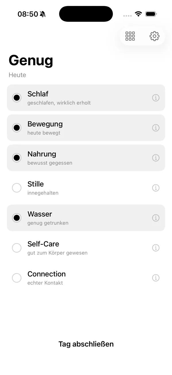
Close the day
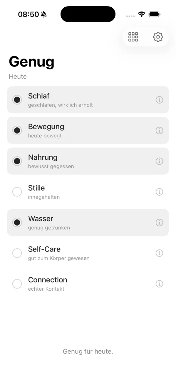
Enough for today
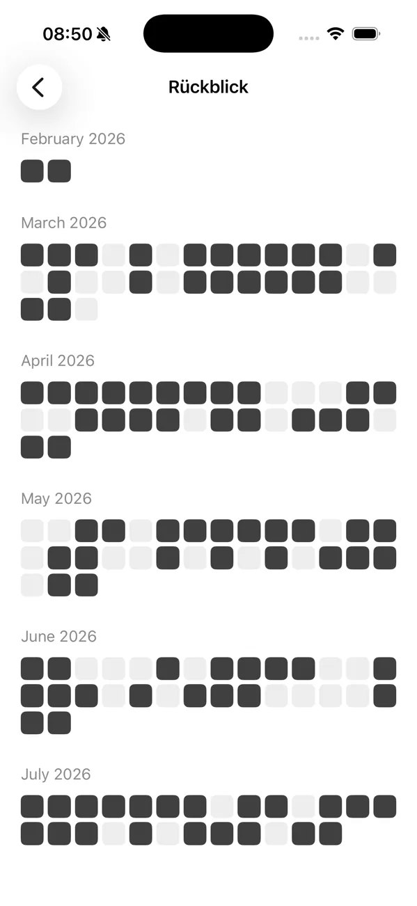
The Rückblick
The second screen was the Gewebe, the fabric: months of closed evenings as small squares, fourteen columns wide so the eye could not turn them into weekdays. It had no count and no streak. Structurally, almost the whole position of the app was already there.
But it had no image of its own. It looked like a careful settings screen. A note in the next day’s work says it plainly: the app made no joy yet.
02Then colour ate the list
Colour entered as a visual answer. Every confirmed thing placed one soft point into a moving background under the same seven rows. The rule written with it was that anything which delights without judging is allowed, and anything that judges stays banned.
That rule did more than restyle the screen. The gradient gradually removed the controls above it. Rows disappeared, then circles, then the list itself. In the Wortfeld, all seven names stood directly on colour. Confirming one made the word disappear and left its colour behind. Skipping one left no trace at all.
The Sammlung was the logical end of that idea. If a day was a picture, the history should be a gallery. Every finished day became a gradient made only from the things that stood, with its shape and mesh seeded by the date so the same day always produced the same image.
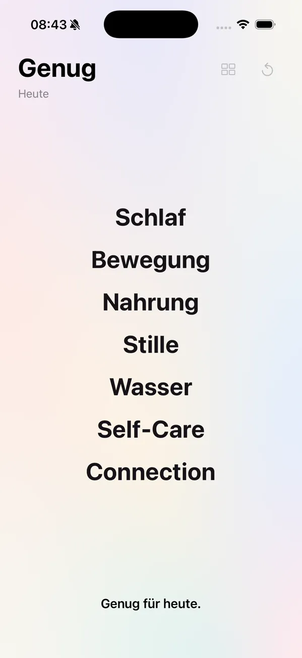
Before
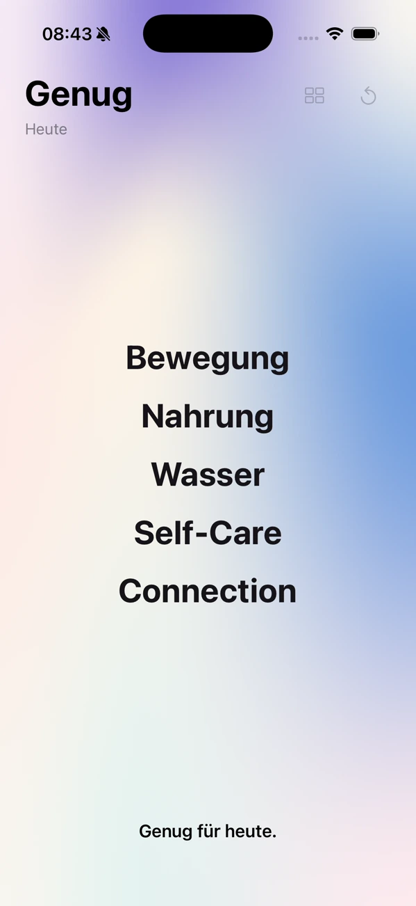
Two removed
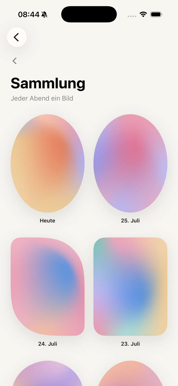
The Sammlung
I still like the thought. I also remember what happened when I used it. The gradients were interesting at first, then they gave me too little. That is a memory, not something I wrote down at the time. The repository records the narrower failure that was visible in the interface.
The melts and spans all failed the same reading test: you could not tell a four-Säulen evening from a two.
The note was written about the gallery pictures. Looking back, I think that narrow reading failure exposed a larger problem: the design had become better at refusing judgement than at helping me recognise my own days. Hard stripes tried to force the count back in. They lasted 33 minutes. By that evening the gradient had left the main screen and the seven colours sat on fixed positions instead.
Those colours survived exactly. They were chosen inside the gradient work, sorted by hue with a dark middle and light edges so that any subset could still compose as a picture. They shipped as flat tiles.
03The gaps became the design
The current app can look like a return to the list. It is not. The important change sits in the week: seven things on fixed rows, seven days beside one another, colour where something stood and quiet space where it did not.
The design describes the concept more accurately than the gradient did. The point is not to do everything every day. It is to keep ordinary things from disappearing across days. A gap is not a failed square. It is the shape that lets the next colour mean something.
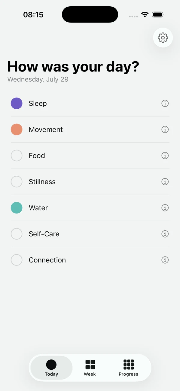
Today
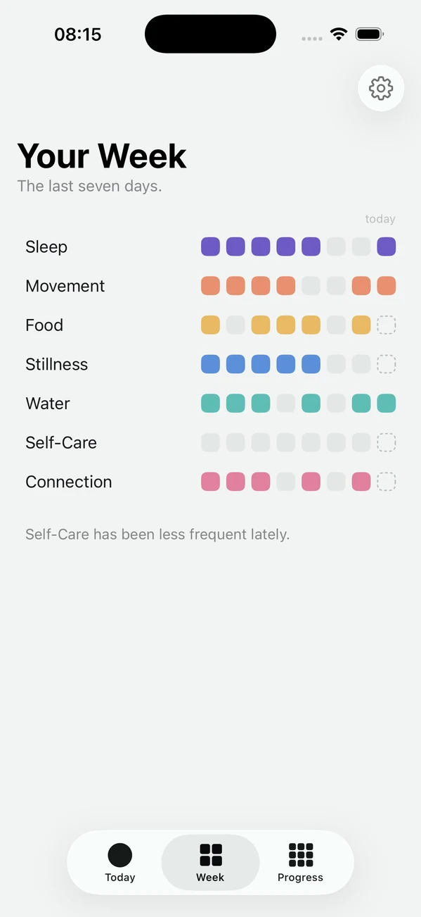
The week
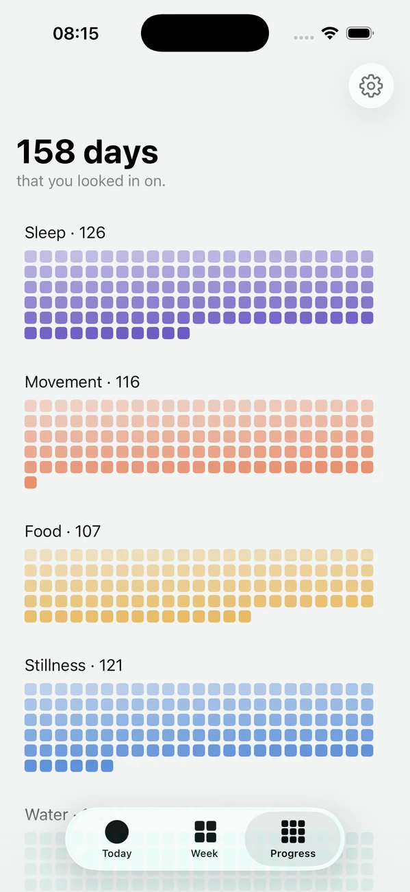
Progress
That is the route from the first list to the current field. The list made the day explicit but had no identity. The gradient gave it an identity and turned the day into an image, but the image hid too much. The tiles kept the image and returned the information.
Interface work was not the coat put on after the product was decided. It was how the decision was made.
Genug for iPhone
See what was there today.
Free. No account, no ads, no subscription.